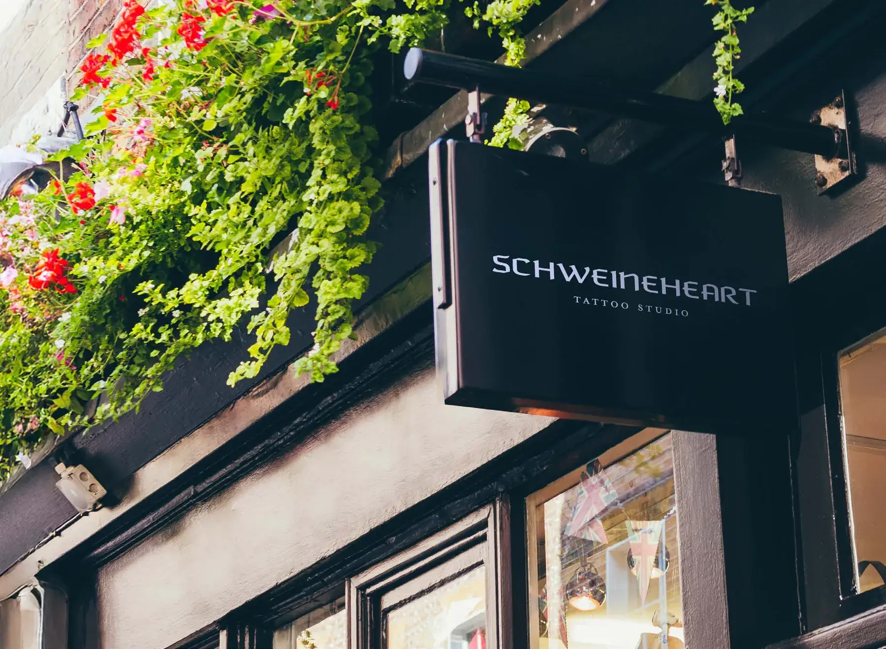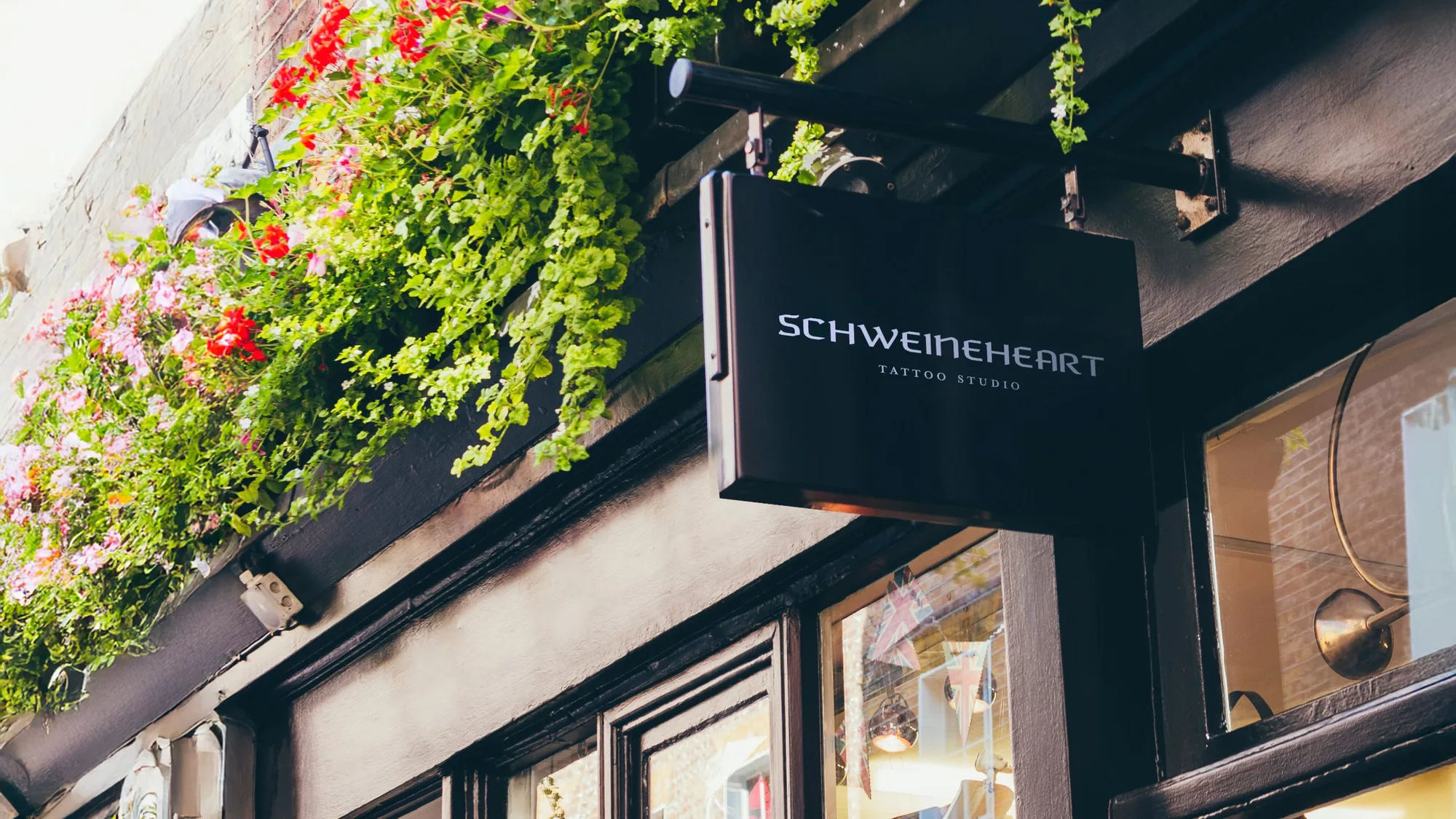
Schweineheart
Breaking Taboos Through Design
Schweineheart emerged as a gentle rebellion in a world bound by convention. It is not a street shop, but a sanctuary where artistic boundaries dissolve. The brand lives by a philosophy of setting taboos aside, inviting clients to explore the untamed territories of expression.
The goal was to translate this raw ideology into a visual language that feels premium and approachable without losing its edge.
The challenge
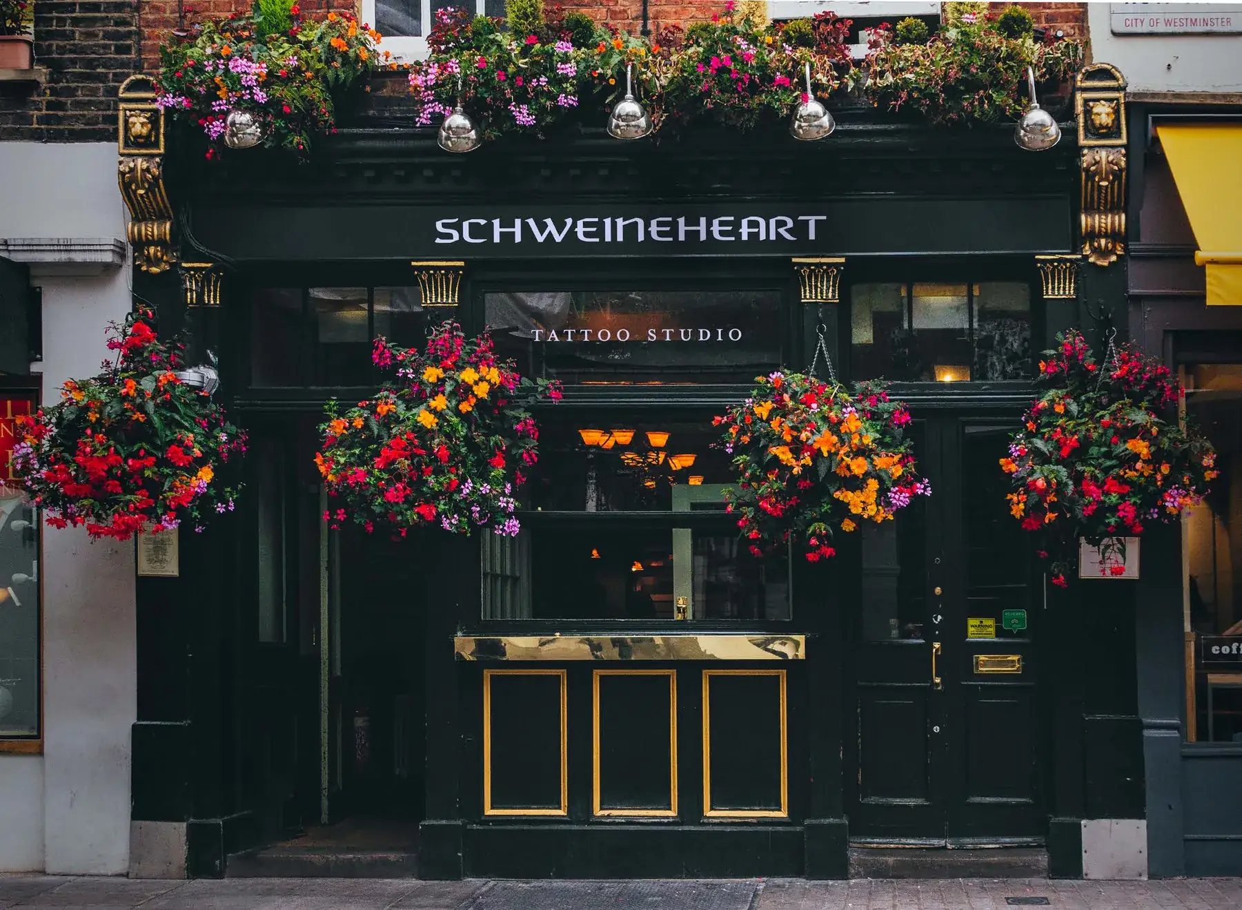
The tattoo industry is visually saturated with aggressive tropes: heavy blackwork, gothic scripts and dark grunge aesthetics. Authentic to the subculture, this language often limits a studio's perception to a street shop and alienates a more sophisticated clientele who seek artistry over adrenaline.
Schweineheart's promise to set all taboos aside carried a risk: visual chaos. The challenge was to show wild imagination without looking disordered, and to turn the energy of untamed territories into a system that feels curated and intentional. The strategic shift was absolute: from service provider to artistic sanctuary.
Creative approach & thinking
The identity is built on contrasts: sacred and secular, classical and contemporary. Religious symbolism creates a rich vocabulary for themes of temptation and positions the studio as a gentle rebellion, a judgment-free sanctuary that welcomes every subculture.
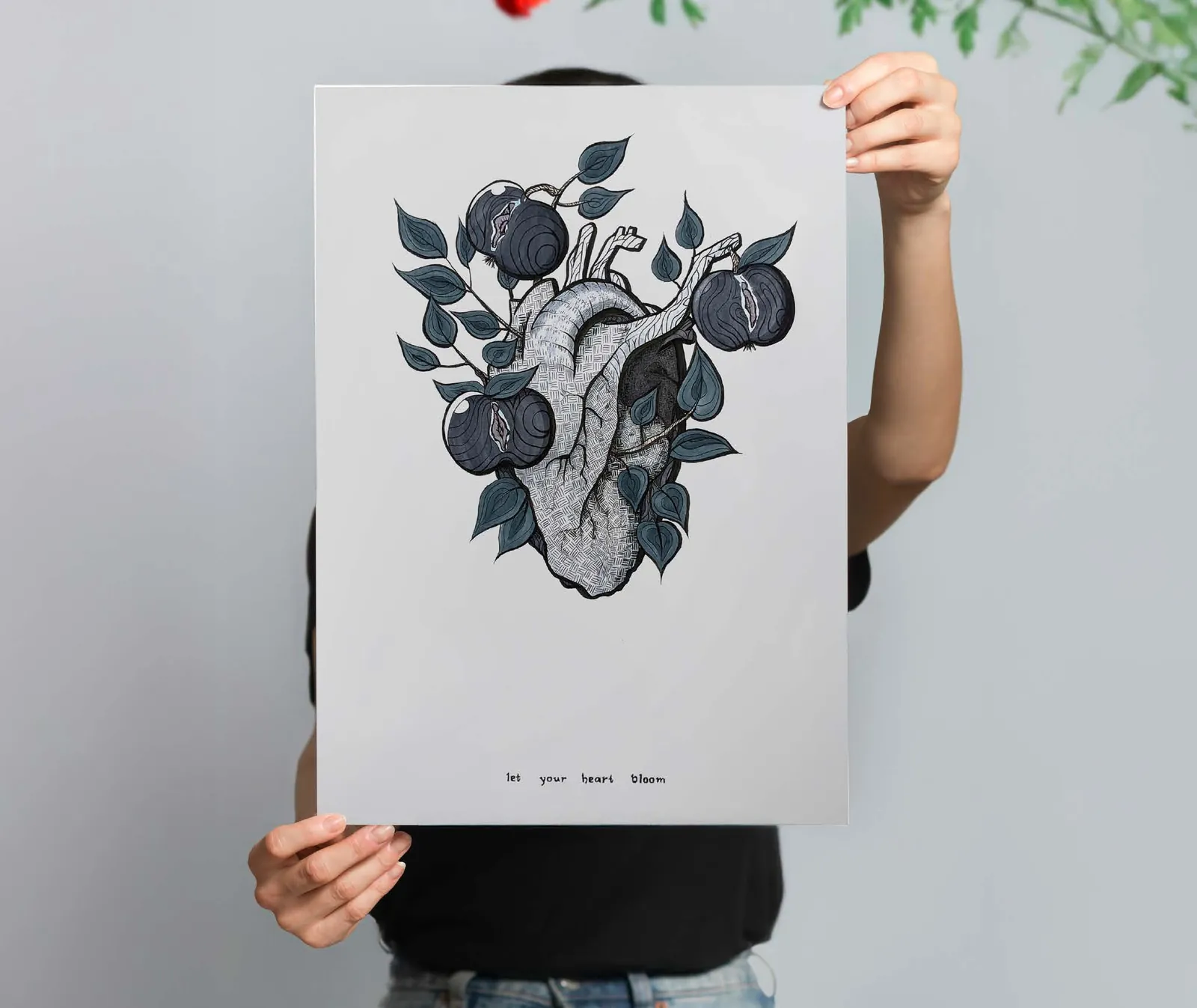
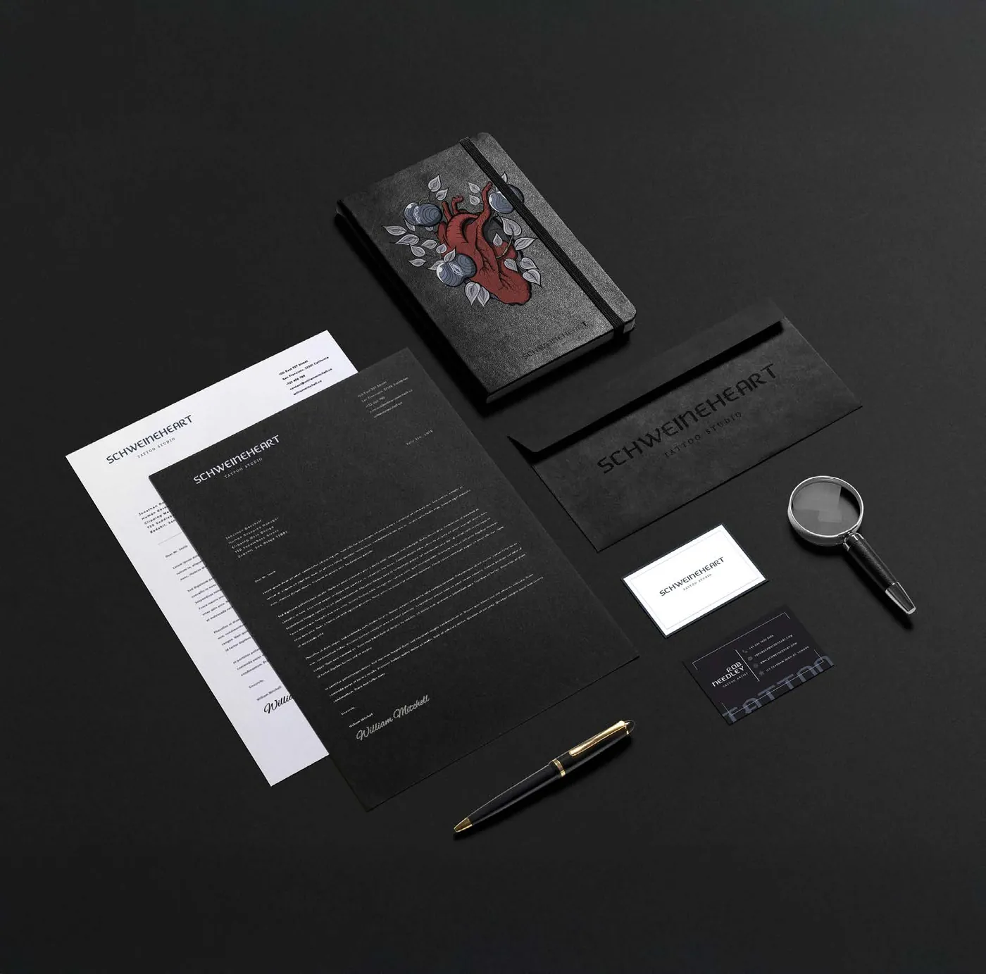
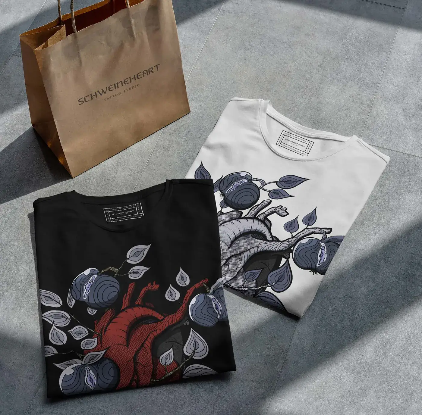
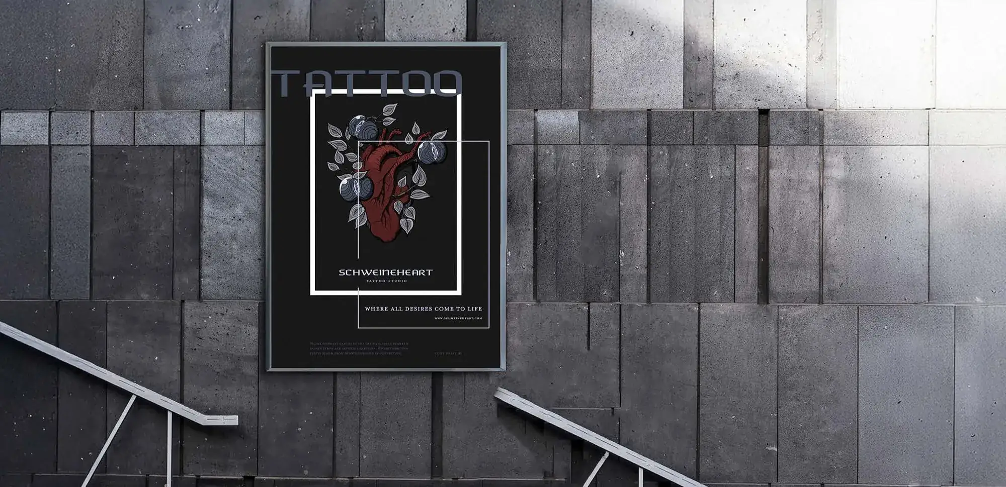
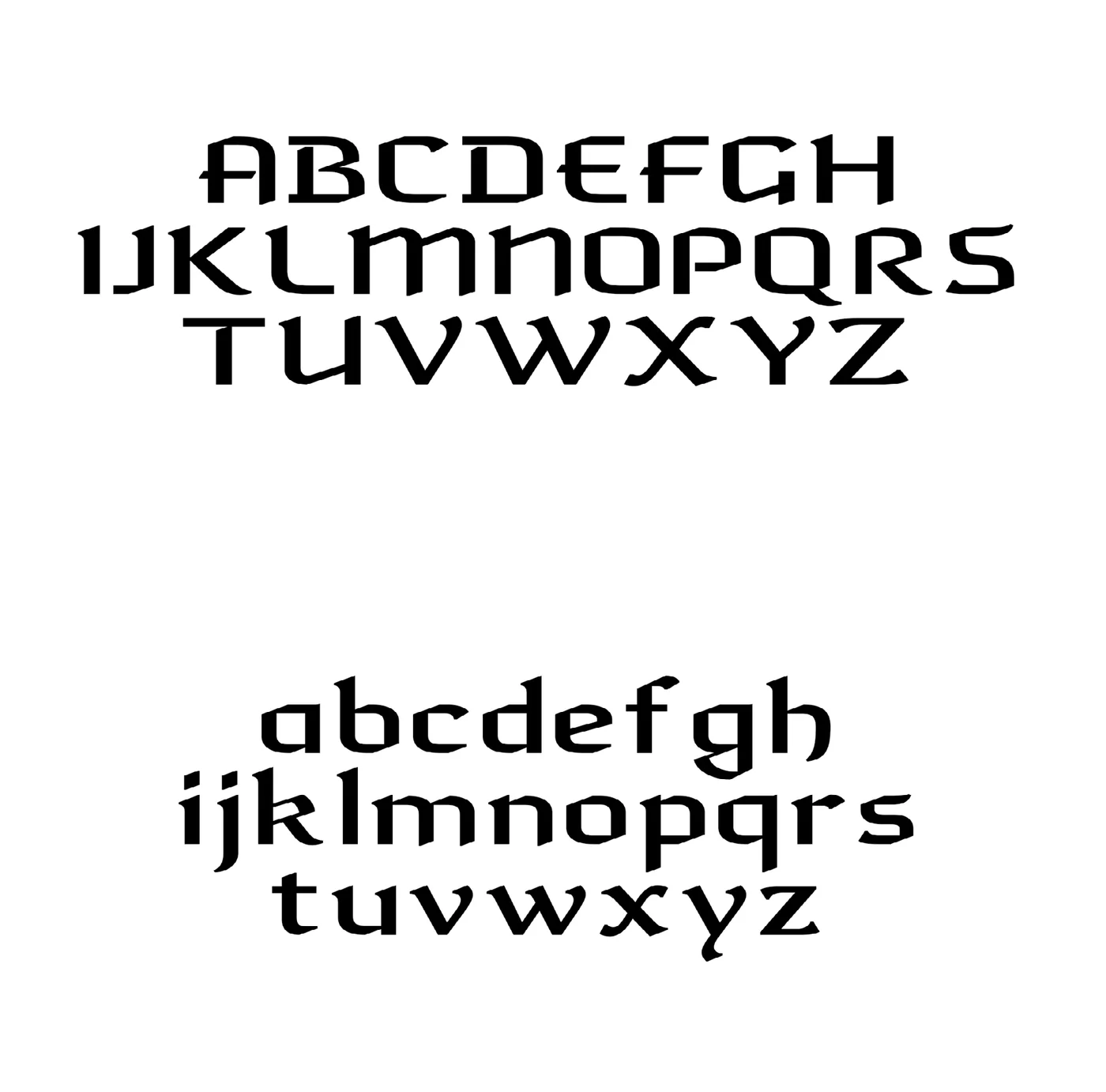
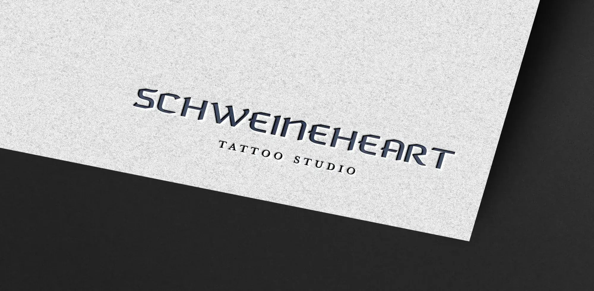
The visual system is anchored by the custom typeface Decadency, which bridges centuries by merging historical elegance with contemporary sharpness. Next to it stands the signature illustration, a provocative play on the studio's name. This duality lets the brand speak in two voices: ethereal innocence and bold defiance.